You can customize just about any aspect of the look & feel of soSIMPLE with the right CSS. To put in your custom CSS, go to the soSIMPLE Calendar Settings layout and click “Advanced”. Then you can paste custom CSS or custom JavaScript into those two fields.
This article will help you identify the right classes for your events in each view.
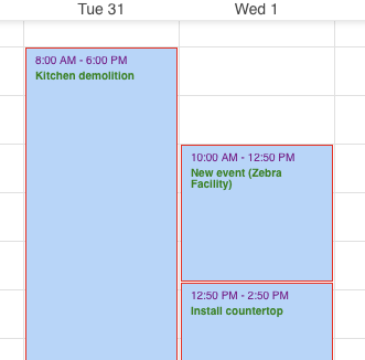
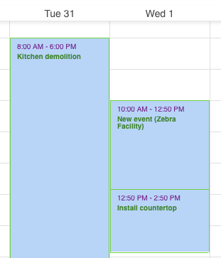
The Day, Week, and Resource (single day) views all display events similarly. The events consist of an event body (.dhx_cal_event .dhx_body) and a title header (.dhx_cal_event .dhx_title). There is also an event wrapper that wraps around the whole event (.dhx_cal_event), which you’d use for making changes to the whole event (backgrounds and borders, for example).
On these same views (Day, Week, and Resource) there are sometimes multi-day or full day events that show at the top of the calendar. Those events share a CSS class with multi-day events on the Month view, and with all of the events on Timeline views (.dhx_cal_event_line).
Many of the event CSS classes are specific to their views: events in the Month view that are not multi-day/full-day (.dhx_cal_event_clear), Grid rows (tr.dhx_grid_event), Map event rows (.dhx_grid_event.dhx_map_line) and Task List/Unscheduled Events (.tasklist-item).
This example CSS will make your calendar look pretty… uh.. colorful… The idea was to help you identify each occurrence of your events.
 .dhx_cal_event .dhx_body{ /*day week resource body of events*/
     color:green !important;
     font-weight: 800;
     font-size:10px;
     line-height:10px;
     border:1px red solid;
     border-top:0;
 }
 .dhx_cal_event .dhx_title { /*day week resource title bar of events */
     color:purple !important;
     font-size: 10px;
     border:1px red solid;
     border-bottom:0;
 }
 .dhx_cal_event_line { /*timeline and multi-day events */
     color:yellow !important;
     border: 2px red solid;
 }
 .dhx_cal_event_clear { /* month timed events */
     color:red !important;
     border:2px orange solid;
 }
 tr.dhx_grid_event { /*  grid event rows */
     color:green !important;
     font-size:10px;
     background-color:pink;
 }
 .dhx_grid_event.dhx_map_line { /*  map event rows and header */
     color:pink !important;
     font-size:10px;
     background-color:brown;
 }
 .tasklist-item { /* task list text contents */
     font-size: 10px;
     color:green !important;
     background-color:purple !important;
 }
Note: the background color for events is usually set in your FileMaker event using a field and passed directly to the html element – that’s why we had to mark them as “!important” to override them here. Usually the best way of changing the background is using a FileMaker field in your event.
We did some fancy footwork to set the red border; we set the event body to a red border all the way around, then removed the top border, then set the event title bar to a red border all the way around, then removed the bottom border. This resulted in a seamless border all the way around both event elements. A simpler way would be to use an outline (not a border, though) around the outer event block, like this:
.dhx_cal_data div .dhx_cal_event { /* similar to border around events in one step */
     outline: green solid 1px;
     outline-style:ridge;
 }